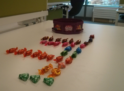
Such is the nature of an office at Christmas, there were several large boxes of chocolates knocking about. I jokingly organised them into groups, forming a bar graph reminiscent of the NOC screens that hover above our team. Everybody laughed, jokes were made about the OCD nature of our team, and chocolates got eaten.
However as the day went on, I noticed that the layout of the chocolates was affecting what I chose. There were very few toffee pennies (my favorite) so I nabbed a couple (I made sure to leave one). There were lots of the coconut ones, so I munched on those, my politeness getting the better of me and no wanting to finish the strawberry cremes which everybody seemed to enjoy. Maybe it was just me, but I think other people found the same thing.
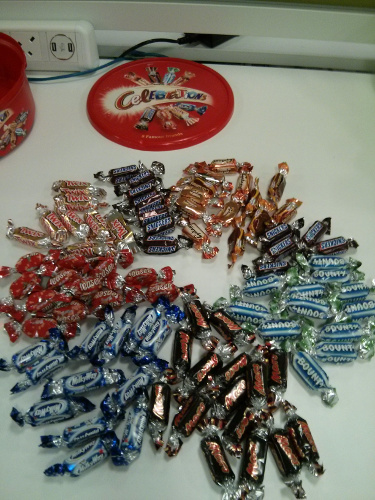
The next day there was a new box of chocolates, so I did the same, only this time I went for a rudimentary pie graph, and something interesting happened; I no longer get any actionable information from it. I couldn’t tell which were running low at a glance for example. Other people in the office also seemed to spend less time choosing, suggesting that they too were getting less information from the layout.
It’s daft I know, but I’ve never before seen such a clear example of the difference between data and information, or how the choice of display so greatly affects how quickly and easily you can get the actionable information you need.

